Tuesday, February 27, 2018

City Symbols (Part 14): Recreating the Torfani Icons

(You might notice that Part 13 is missing.  That's not superstition.  It was a posting on some more fantasy elements that didn't work out, and turned out to be too short to be worth posting.)

Now that I have all (or at least most) of the elements in place, I'm going to work on recreating the icons from the Torfani map.  (Very similar icons are used on the Domhantyr Orientalis map.) To refresh your memory, this is a portion of that map:

There are roughly three different city sizes on this map.  The smallest icons look like this:
There's a fair amount of variation but typically the icon has one to three single or two story buildings.  Buildings can be round or square (but more often square) and are shown in (faux) 3D, although sometimes the sides of buildings and roofs are not shaded.  There are no decorations except an occasional “shed" peeking out from behind a house. Roofs are generally “peaked" for square buildings (with an occasional battlement) and domed for round buildings.  Some buildings lack doors, but all have windows.  Roofs and buildings are both the same color as the land, and doors are not filled in.  The building outlines are drawn in a dark brown color.

Putting all that together produces this:
Which (given the constraints) looks like a pretty good reproduction to my eye.  The shading is probably a bit too dark, so I'll tone that down.

The next size city looks like this:
In most ways, these are the same as the small icons.  They typically have 4-5 buildings and some buildings are now entirely behind the front buildings. Sometimes neighboring buildings are the same height.  Also, there are also no obvious sheds on these buildings.  Some of the towers seem to be taller than the other buildings.  Interestingly, the side shading seem to have completely gone missing in these icons.  I could reproduce that, but I'd rather keep it in.

Putting all that together produces this:
This brings us to the large cities, the most complex icons on the Torfani map.
The large city icons introduce a bunch of new features (many of which I implemented in the past few posts).  Most of the large city icons have tall towers, and often these are “fantasy" towers with some kind of strange architecture.  For the first time, buildings can be three stories (or higher) and some of these tall buildings have pennants.  There are typically about seven buildings in a large city icon, and sometimes there's one building substantially larger than the rest.  The buildings are more shaded than in the smaller cities, and many roofs are now colored.  The city is surrounded by a city wall, often with slanted sides and usually with a door or gate in the front center.

Some features I haven't implemented:  There are some “cast shadow" effects where entire buildings or parts of the city wall are in shadow.  Cities on rivers are split across the river, or are shown with a bridge over the river.

I'll start with the medium city icon and up the number of buildings.  I'll also allow three story buildings, which are tall enough to trigger the pennant code.
At this size and with this many buildings, it becomes obvious (looking at the baseline of the icon) that Dragons Abound doesn't handle overlapping correctly, particularly with round buildings.  Since I'm faking the 3D aspects of these buildings and not actually modeling them in 3D, it's pretty hard to get this right.  But in this case the bottoms of the building will be covered by the city wall and it should be less obvious.

Speaking of the wall, let's add it.
The distribution of building heights in the Dragons Abound looks wrong.  I'm randomly selecting buildings between 1 and 3 stories high, but in the real icons there are fewer tall buildings, and they're rarely next to each other.  Another problem is that while the Torfani buildings have some faux-3D shading, in the biggest icons the buildings don't show any side depth.  I'm not sure I want to entirely eliminate the side depth but I can certainly dial it back.  Here's a first attempt at that:
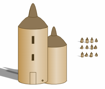
Upon examination, almost all of the tall buildings in the Torfani icons are round and narrow (e.g., towers).  They mostly have eaved or domed roofs, but I'll throw in the occasional onion roof.
Now I want to start to add in some of the "fantasy" elements.  The first element is to sometimes have a cupola on a big domed building.
Next I can add in the "fantasy" towers like in the leftmost Torfani examples:
Finally, I can add the towers with skybridges between them:
I can also throw in "pyramid" towers where each successive floor becomes smaller:
That more-or-less completes the large city icons, so let's see how this all looks on a map:
That's not too bad.  The long blank city wall in the Suit icon looks a bit jarring, though.  I can address this a bit by encouraging more inflection lines and coloring in the door.
Better perhaps, but I'd still like to figure out a better way to do some more painterly effects in SVG.

Meanwhile, here's another problem:
The icon for Shimpes is “in" the lake.  This occurs because the icon largely ignores whether it overlaps with features.  In general, since the icons represent something “sticks up" from the map, it's okay for it to overlap another feature behind it.  However, we'd like to avoid have the baseline of the icon right in another feature like a lake.  I can accomplish this by adding another criteria to the label placement algorithm that tries to avoid overlapping the baseline of the icon with a feature:
This also helps city icons in mountains and along the coastline find better positions.

Here's a side-by-side comparison of the Western Torfani map and the current Dragons Abound replication:

Tuesday, February 20, 2018

City Symbols (Part 12): Fantasy Elements

One element that distinguishes the large city icons on the Torfani map is that the icons contains some fantastical-looking buildings -- mostly fanciful towers:
And since I am doing fantasy maps, I'd like to include some fantasy elements in my icons as well.

I'll start with fantasy towers like the ones above.  These are basically skinny windowless towers with some "donuts" around them.  I already have a mechanism for creating towers with different sized floors that I used for creating towers that get narrower, and I can reuse that to create these sorts of towers by making some of the floors bigger:
We'll see how those look in icons, but for the moment I think that's good enough.

Another fantasy element I want to add is onion dome roofs.  Although to be fair, this isn't really a fantasy feature, since these roofs are common on Russian churches:

The S shape of the side of an onion dome requires that I implement a cubic Bezier curve, but since I have a quadratic Bezier curve implemented already and the equations aren't that different, that isn't too difficult.  Calculating the proper control points is actually the more difficult job, but with some experimentation I get something that looks okay:
Note that this "curve" is actually 9 line segments.  SVG natively supports Bezier curves and can draw this beautifully, but for my purposes it's best to have it as line segments.  I can make this as smooth as necessary by generating more line segments, but at map scale 9 will be more than sufficient.

Using this as a profile for a roof yields this:
What else?  This excerpt from a fantasy cities wallpaper suggests some ideas:
Cupolas and skybridges between buildings.

Let me tackle cupolas first. As in the picture above, these are often round, domed structures on domed roofs.  In fact, it's often a miniature version of the building it sits upon, which suggests I can recreate this by stacking a smaller building on top of a larger building, as I did to create the fantasy towers above.  
Although cupolas typically do have windows (they often serve to let light into the area below the dome) I've turned them off here; it's simply too much detail for such a tiny icon.  (I'm also not allowing cupolas on cupolas, I'm not crazy!)  Cupolas don't look very good on one story buildings, so I should probably turn them off there, too.

It turns out that cupolas look good for some other roof types as well, such as pagoda roofs:
Doing cupolas correctly in faux-3D is a little more challenging.  The cupola needs to line up correctly with the house roof on both the front and the side, which requires some calculation.  But once that's done, it pretty much works automatically for all the different roof styles.
A natural extension of this idea is to have just a second roof on top of roof.  This may sound odd, but it's not entirely uncommon:
That's basically a stack of different roof types.  Or in a pagoda:
This is actually a bit more complicated to implement than cupolas.  An initial thought is to stack roofs by essentially making a cupola with a zero stories or a single story of zero height, but either of those solutions will break a fair bit of code that assumes houses have to have at least one reasonable story.  So instead I'll have to allow a building to have multiple roofs.  A second problem is the the current roof code expects a roof to sit on a house; that will have to change to allow a roof to sit on a roof.

Peaked roofs are fairly straightforward, so I'll implement them first to see how it looks:

That's not too bad.  This initial attempt isn't too visible at map scale, but I think it has enough potential to do the other roof styles.  Next up is pagoda roofs:
Hmm.  There seems to be a problem, but I can't quite put my finger on it.  :-)  The problem here is that the "dip" in the side of the roof is big enough that the sides of the roof get inverted.  With that fixed and some adjustments I have this:
Somewhat visible at map scale; this might benefit from having (say) three roofs.  Here's what it looks like in 2D:
The last roof type are eaved roofs that come to a single point.  (That name doesn't make a lot of sense, I know.)  On round buildings these look like this:
And on square buildings:
That looks somewhat absurd in the full-size drawing, but much better at icon size.  This roof has a different appeal if there's no overhang on the extra roof:
Domed roofs get you variants of this:
Not particularly interesting and possibly NSFW.  And finally, onion roofs:
That looks interesting at the icon scale.  Of course, none of these doubled roofs look particularly "realistic" but the point of these elements is to give a fantasy feel to the map, so that isn't really a drawback.

Now let me work on skybridges.  The first step is to draw two identical towers.  A tower (as I covered in a previous post) is just a tall skinny building.  To get two identical towers, I create a first tower and then copy it and draw it offset to the first tower: 
(In general the problem of making a deep copy of a Javascript object is complex and fraught with danger, but for this particular application I can get away with a solution crafted just for copying these buildings.)  The next step is to add the skybridge between the two buildings. 

As a first step, let me insert a one-story building to fit in-between the two towers:
I've made these round buildings, and they obviously don't look anything like a bridge.  Now I'm going to take advantage of how round buildings are drawn by using a negative offset for the bottom of the building.
Obviously the roof of these "buildings" are broken, but the bottom looks like we'd expect for a skybridge.  So I need to turn the roof off and hoist the building up the tower:
There are a couple of problems with these bridges.  The worst is probably that the shading in faux-3D is wrong.  Since these are really "round" houses, they get shaded accordingly.  Since they're actually flat, they should be a solid shade rather than a right-to-left gradient.  That isn't too bad a problem, so I'm inclined to just leave it "as is" rather than add some more special cases to the code.

Wednesday, February 14, 2018

City Symbols (Part 11): More Torfani Features

In the previous posting, I started adding city icon features I need to replicate the icons in the Torfani reference map.  The next thing to look at is the city wall which appears in the icons for large cities:
The city walls in these icons are quite complex.  They're not uniform rectangles, but instead seem to follow the land or flow around buildings.  Sometimes the top is fairly straight but the bottom is not; sometimes the bottom is fairly straight and the top is not; and sometimes both the top and the bottom vary.  They have some shading to indicate that they aren't flat, and likewise the sides of the walls are sometimes slanted to suggest they're wider at the base than at the top.  Many of the walls have openings to represent doors or passageways.

Back in Part 5 of this series I developed a basic wall:
shown here with battlements and doors.  To start with, I want to make the wall less linear.  To do that I'll perturb the baseline of the wall in much the same way I perturb mountain outlines, and tweak the perturbation parameters until I get something that looks reasonable.  Here's an initial effort:
In the Torfani icons, the wall looks to be more than one story high, so here's a slightly larger version with battlements:
This seems to look okay, although I'll withhold full judgment until I see it in an icon.  I'm always vaguely dissatisfied working with noise for things like this -- by it's very nature it is difficult to get something that looks good all the time.  I might be better off with some more limited but intentional way to add contour to the wall.  With my mountain symbols, I ended up with a mix of both types.

In the Torfani icons, the wall also has shading where it is turned away from the light.  In Dragons Abound the light comes from the right side, so the wall is turned away from the light where it angles downward on the map.  I can detect these spots by walking along the top or bottom of the wall and measuring the slope.   Then it's a matter of constructing a shading area and filling it in with a darker color:
I can't say I much like the look of this.  Let's call it a work in progress.

Another approach the Torfani artist used was to place lines to indicate the wall structure.  The general idea is to put a vertical line at points where the wall changes direction substantially.  To do this, I walk through the topline of the wall, and wherever the slope of the wall shifts significantly, I draw a line to the corresponding point on the baseline of the wall.
This can be made more subtle and effective by fading out the line from top to bottom (and/or the reverse).
The wall shading I tried above looks better if I tone it down and combine it with the inflection lines.
Taken together, this is starting to look pretty good.  One casualty here is that the door is no longer "carved" out of the wall to reveal what is behind the wall.  That's probably not a big loss.

Now let me tackle making the wall wider at the base than at the top.  This shows up primarily in the side profile of the wall, which I can accomplish just by pushing the ends of the baseline of the wall out a bit:
However, that leads to a slight inconsistency when I turn on the inflection lines.
The inflection lines still go straight up and down.  It would be better if the lines became increasingly more angled as they near the edges of the wall.  To do this, I need to stretch the baseline rather than just pad it on each end.  That's not too hard to do -- I just multiply the X value of each point on the baseline with a stretch ratio (greater than 1) and then shift it backwards to keep the baseline centered.
Now the inflection lines (and the wall shadows) reflect the slant of the wall.  I may need to come back and tweak walls when I see them used in a city icon, but for now I think this is sufficient.

The next feature to implement are the pennants flying above some of the buildings in the Torfani icons.  To start with, I'll implement spires.  These are just pointed lines straight up from the center of the roof:
Pennants are essentially triangles on the top of the spires.  The triangle sticks out to one side or the other, and it usually angles downward.  The triangle is about 2x as long as it is tall.
Let me add a color to the pennants to make them stand out a little better.
This looks pretty good, but it's a bit more artistic to add a little downward curve to the flag.  I have to take a straight line and turn it into a curve in many places in Dragons Abound -- such as along the bottom of a circular building.  So it's pretty straightforward to take the two lines of the pennant and a dip to them.

The Torfani icons also have some pennants that are shaped like a swallow's tail.  If you're thinking it's overkill to implement a second pennant shape for such a tiny detail you probably haven't been reading this blog for long ;-).  To start off with, I'll add rectangular flags.
A swallow tail requires cutting a triangle out of the end of the rectangular flag.
If you're thinking that implementing three different pennant shapes is sufficient overkill then you really should go back and re-read the earlier parts of this blog.  Because as long as I have pennants, I might as well implement flags.  To start with, I can have a flag with a circle on a different-colored background (like the Japanese flag):
Even at this very small size, the flag detail is visible.  Another flag option is a vertical stripe in the middle of the flag:
Unfortunately, at map scale that's not really distinguishable from the circle.  A horizontal stripe works better:

Another version that's distinguishable is a flag divided into two triangles:

Normally I intend to use the flags to distinguish different nations -- all the cities of a nation will fly that nation's flag.  The combination of different colors and flag types should help make them distinct.  But here's an example of a mix of different flags:
It's fun to see just how much can be accomplished at this tiny scale.  Now you can accuse me of overkill :-).